
Flex Next-Generation Editing Capabilities.
Full Flexibility for Total Creativity.
Create sophisticated, modern sites, easily and quickly by arranging elements exactly as you want. No compromising on design.
Out-of-the Box Responsive.
Flex Sections are completely responsive and automatically look great on every screen. If you like, customize per breakpoint.
You Control Access with Permissions.
With the Add Flex Permission, you control who can add Flex Sections to a site—and who can’t.
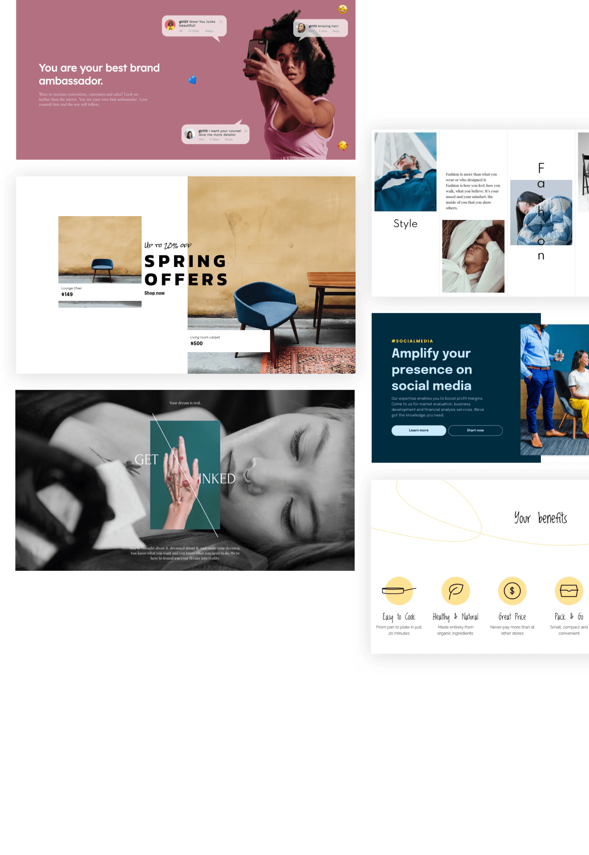
With Flex, Everything Is Possible.

DudaFlex Webinar.
Hosted by Amir Glatt, Duda Co-Founder and CTO, and Maayan Mor, DudaFlex Product Manager, we’ll dive deep into DudaFlex, explore its design possibilities, and answer all of your questions.
What is DudaFlex?
Learn about the powerful new editing capabilities that enable you to build fully responsive sites, quickly and easily.
New Design Possibilities
See Flex in action in a live demo that shows you how to create pixel-perfect, gorgeous designs in your sites.
Flex Features.
Responsiveness.
Flex Sections are automatically adjusted per breakpoint. We do the heavy lifting, so you don’t have to.
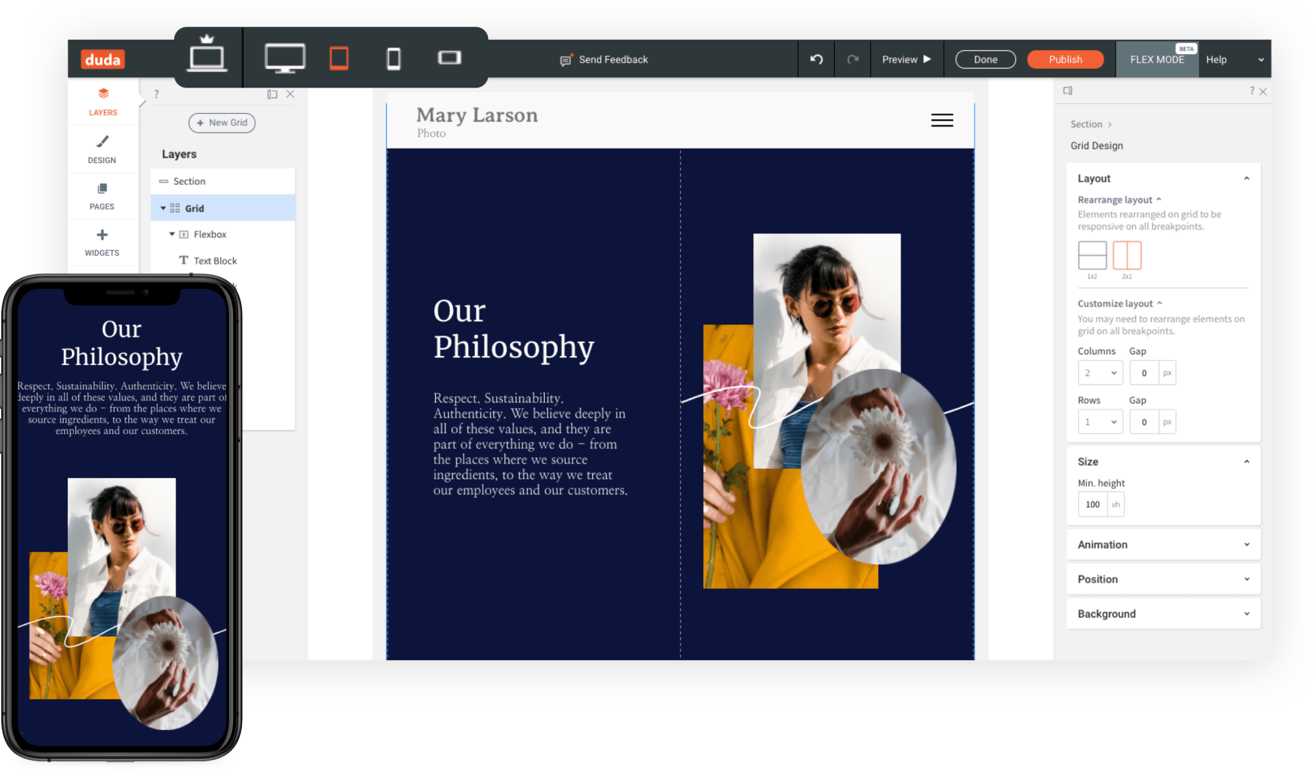

Auto layout
for responsive and fast site creation.
Auto layout.
Site-building is simple with automatic layouts that adjust and rearrange when items are resized.
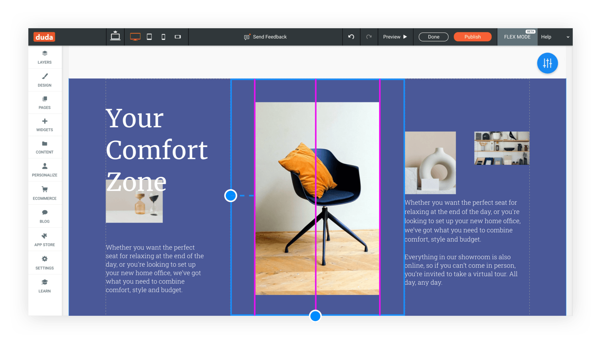
Snapping.
You've got complete design accuracy with guidelines that mark the spot so you can snap elements into place.
And that’s not all.
With DudaFlex, you also have:
Complex Layouts
Multiple Size Units
Reusable Elements
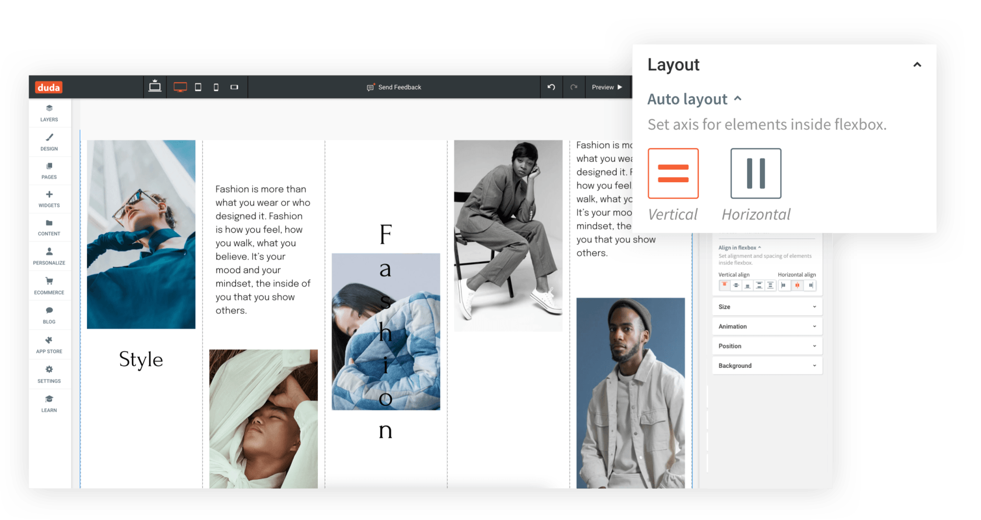
Flexbox
Layers
CSS Grid
What You Get With Flex.
Designers.
Build the websites of your dreams. No limitations. No need to compromise.
Clients.
Your clients get fresh, modern, high-converting professional websites that look fantastic.
Developers.
Based on CSS Grid and flexbox technology, Flex runs perfectly without coding, so you can invest your time elsewhere.
What People Are Saying About DudaFlex.
"Creating in Flex was instant and seamless. Took me 10 minutes to get the hang of it!"
Mark Prictor, Front-End Engineer
“I believe DudaFlex will allow webmasters to feel free.”
Eric Camilleri, Product Owner
Getting Started in Flex Mode.
1.
Open any Duda site.
2.
Add a Section
and choose
a Flex Section.
3.
You're in Flex Mode.
4.
Take the tour, follow a tutorial and start building.
FAQs
-
DudaFlex Terminology
Grid: The vertical and horizontal lines that give structure to the Flex Sections. Grids do not have content, but they enable you to arrange your content.
Cell: The space created by the vertical and horizontal lines of the grid. In a single grid, all cells are the same size.
Flexbox: Elements inside a flexbox stay fixed along a vertical or horizontal axis, and can be manipulated all at once. Reposition them in the Section, duplicate them, etc.
Container: Elements can be placed anywhere you want inside a container. Their position will stay relative inside the container, and at all breakpoints.
Breakpoint: Point where a design adjusts for a specific screen width, enabling design to be responsive as it scales up and down. Default breakpoints are: main desktop (1025px-1399px), wide desktop (1400px and above), tablet (768px-1024px), mobile (767px and below) and mobile landscape (468px-767px).
Layers panel: Left-side panel that displays the elements in the Section (grids, widgets, text boxes, etc.). From here, you can select, rearrange and hide elements.
Design panel: Right-side panel that displays design controls for layout, sizing, alignment and more.
Learn tab: Access tutorials, videos and onboarding from here.
Sizing: You have multiple sizing options in Flex.
- A: Size automatically determined by content.
- Pixel (px): Size stays the same on every screen size.
- Viewpoint width (vw): Percent of width when displayed on a given screen. 10vw is 10% of the viewport width. 100 vw takes up 100% of the screen width.
- Viewpoint height (vh): Percent of height when displayed on a given screen. 10vh is 10% of the viewport height on every screen size.
- Min & max: Smallest/largest measurement of an element. This setting ensures that an element does not get smaller/bigger than this when resizing.
-
What’s the connection between the Duda editor and DudaFlex?
DudaFlex is an inline editing capability that’s integrated with the Duda editor. Websites can contain both regular Sections and DudaFlex Sections.
-
How do I access Flex?
Open a site, add a Section, and choose a Flex Section. You can also access Flex by right-clicking on the Row label, and selecting Add > Flex section.
-
Can I prevent clients from editing Flex Sections?
Yes, you can. To prevent clients from editing a Flex section, right-click on the section to reveal the Context menu and click “Lock for client editing.”
-
How can I control who edits and adds Flex Sections?
You can control this with permissions.
Team members with the Add Flex permission can add Flex templates and Flex Sections.
Clients with the Add Flex permission can add Flex Sections to their site.
Clients with only the Content Editing permission can edit content in a Flex Section, but they cannot access Flex Mode.
Clients with the Full Editing permission can access Flex Mode to edit Flex Sections already on their site, but they cannot add a Flex Section.
-
How can I make my entire site, not just Flex Sections, responsive?
The Duda editor supports responsive site layout for desktop / tablet. To enable this, go to Global Design > Site Layout and toggle on the Responsive Desktop/Tablet.
-
Can I reuse Flex Sections as Team Sections?
Yes! Flex Sections can be saved and used by team members who have the Add Flex permission.
-
Do I need to pay extra to use Flex?
Not at all. Flex is an integral part of the editor.